Ashlar Atelier
Fonts: Marcellus + Jost
Soft linen and bronze feel calm and expensive, which suits private homeowners.
Website design portfolio
We don’t just design pretty pages. Every site starts with strategy, then structure, then design, so it’s built to bring in enquiries, bookings and sales. Here is the work.
Taking on 2 new clients this month.
10 concept websites across 9 industries. Click any one to open the full site in a new tab.
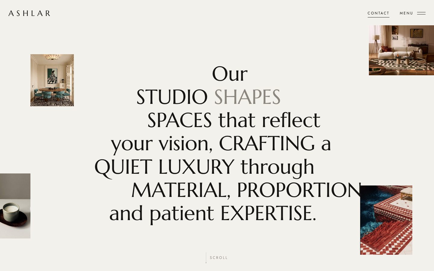 Ashlar AtelierLuxury interior design studio, LondonView site ↗
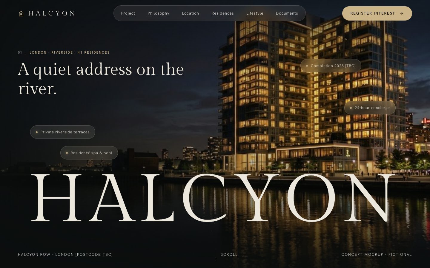 Halcyon RowRiverside residences, LondonView site ↗
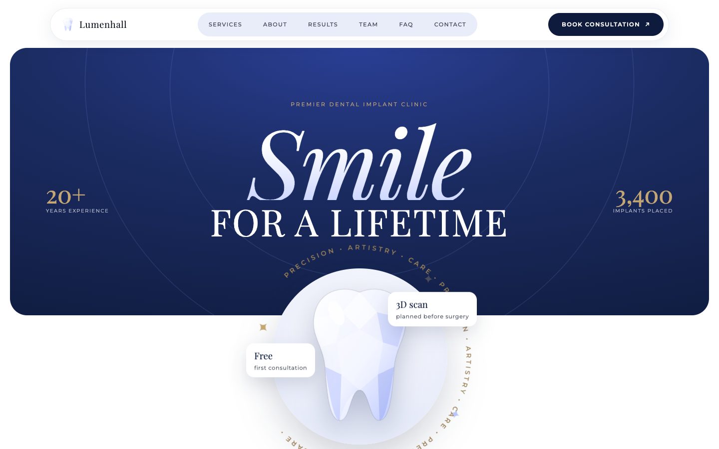 Lumenhall DentalImplant and smile design clinicView site ↗
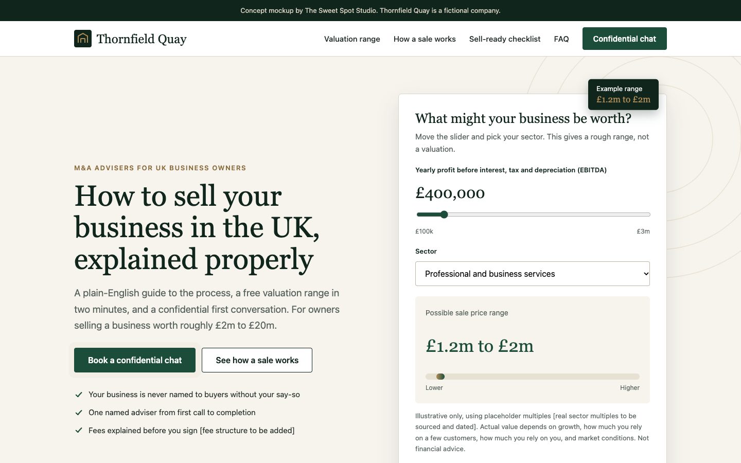 Thornfield QuayM&A advisers for UK ownersView site ↗
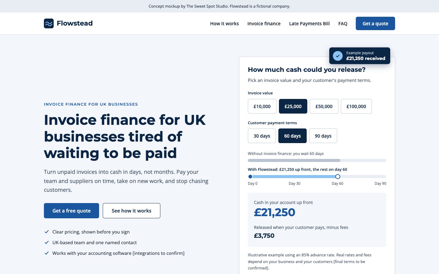 FlowsteadInvoice finance for UK businessesView site ↗
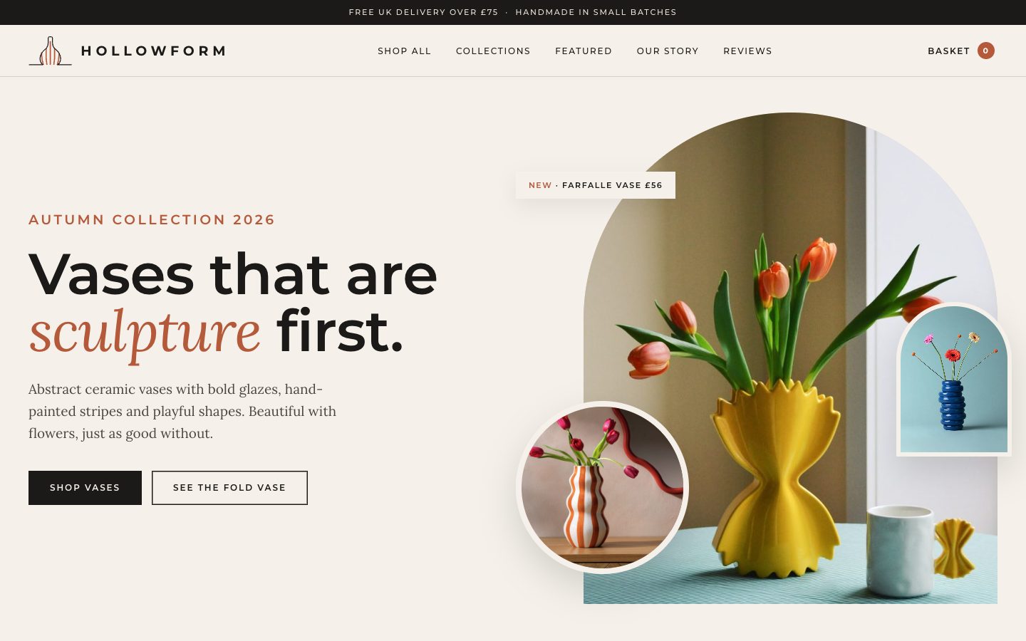 HollowformAbstract ceramic vases and home decorView site ↗
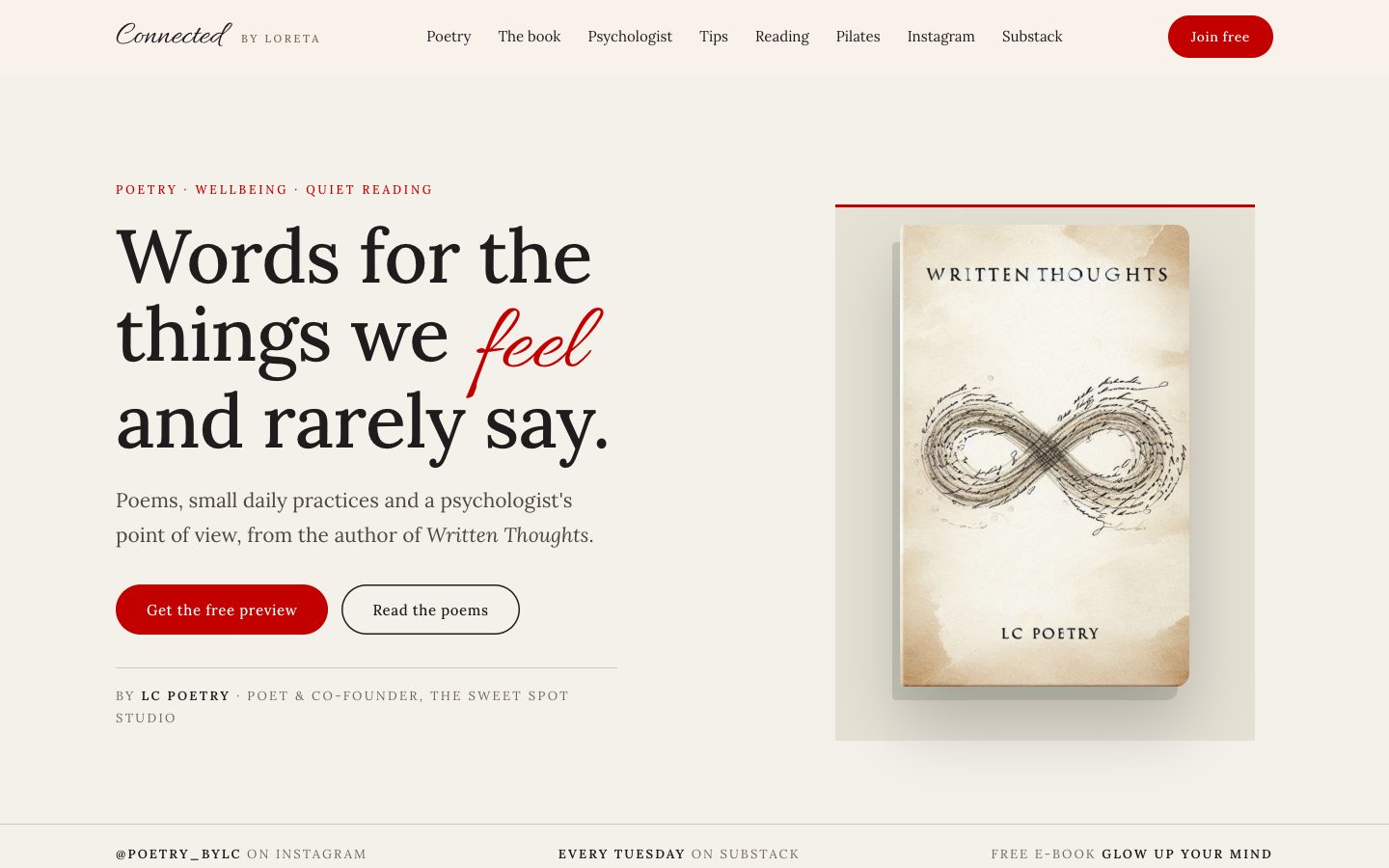 Connected by LoretaPoetry, wellbeing and quiet readingView site ↗
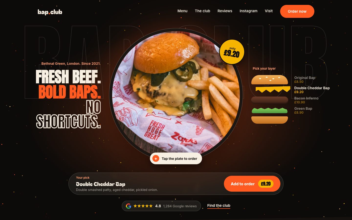 Bap ClubSmash burgers, Bethnal GreenView site ↗
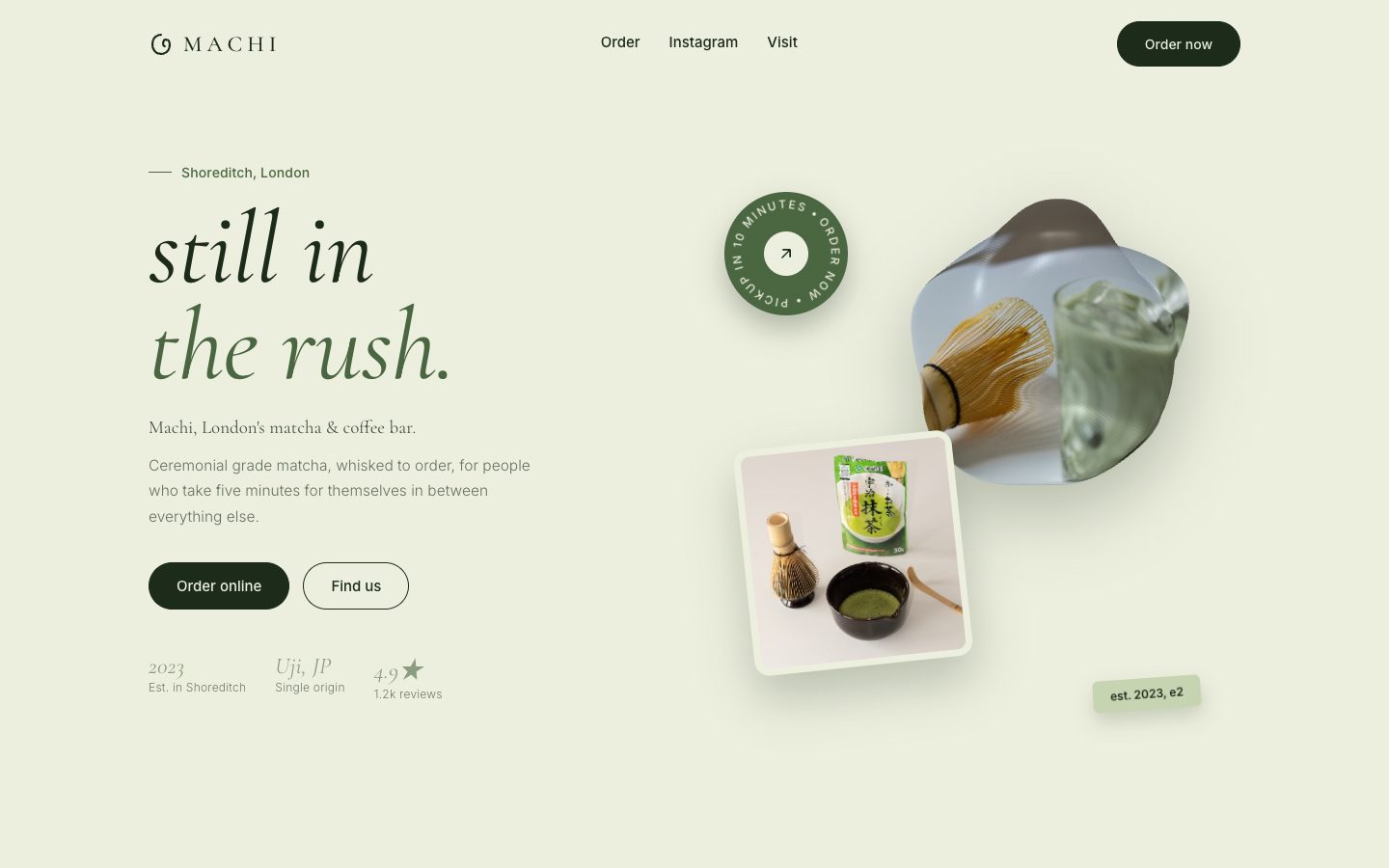 MachiMatcha and coffee bar, ShoreditchView site ↗
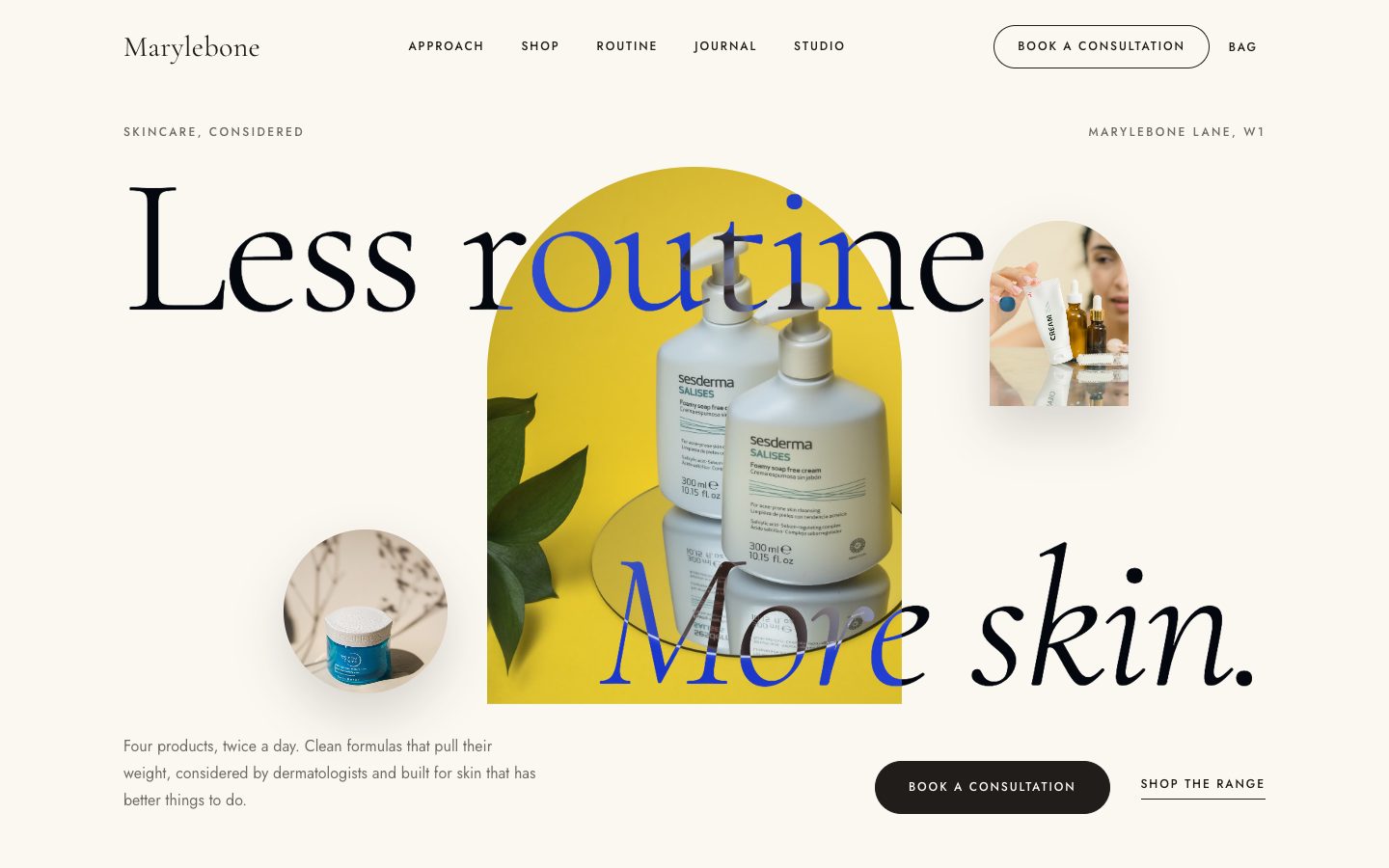 MaryleboneDermatologist-considered skincareView site ↗
A note on these projects. These are concept builds created to show our strategy, design and search approach across different sectors. Brand names, people and copy are fictional.
A beautiful site that doesn’t know who it’s for won’t grow your business. So every project follows the same three steps, in this order.
We audit what you have, study your competitors and agree who the site is for and what it should achieve.
A simple black-and-white blueprint of every page, so we agree the structure and messages before anyone talks about colours.
Only then do we design, write and build, with speed, mobile and Google visibility included from day one.
Strategy first. Wireframe second. Visual design third.
Choose a project, then scroll through its whole homepage right here. You will also see the goal, the strategy behind it and what we built.
The goal
Our strategy
What we built
Every website is made of small interactive pieces. These are six we build most often, explained simply. Try them out.
A button should always tell you what happens next.
Click one to try it
Why it matters: visitors know their click worked, so they don’t give up or tap twice.
Light or dark mode, list or grid. People browse the way they like.
Why it matters: visitors who feel comfortable stay longer.
A quote tool that responds as you move it. No form, no waiting.
You could receive up to £34,000 (example figures)
Why it matters: people who see a number are far more likely to enquire.
Visitors customise their order step by step and see it come together.
Base
Milk
Matcha with Oat
Why it matters: ordering feels easy and a little bit fun, so more people finish.
Pick a day, pick a time, done.
Why it matters: fewer steps means more bookings.
Common questions in a tidy list. Click one to open it.
A one-page site usually takes two to three weeks. Three to five pages takes four to six, and larger builds are scoped on a discovery call.
Yes. Structure, headings, speed, structured data and a sitemap are built in from the first wireframe, not added at the end.
Yes. We hand over a site you can update, with a short walkthrough, and we can keep tending it for you if you prefer.
Why it matters: visitors get their answer without contacting you, and Google can show these answers in search results.
We choose colours and fonts to suit the business and the people it wants to reach, never a template. Here is the thinking behind each one. Tap a colour to copy its code.
Fonts: Marcellus + Jost
Soft linen and bronze feel calm and expensive, which suits private homeowners.
Fonts: Gilda Display + Hanken Grotesk
Deep night tones with champagne gold set an exclusive, after-dark mood for riverside living.
Fonts: Cormorant Garamond + Montserrat
Navy builds clinical trust, soft periwinkle keeps it friendly and gold adds a sense of quality.
Fonts: DM Serif Display + DM Sans
Deep green and brass say stability and experience, which is what owners want from an adviser.
Fonts: Montserrat + Open Sans
Confident blues feel financial and dependable without being cold.
Fonts: Lora + Montserrat
Warm clay tones come straight from the products, so the vases do the talking.
Fonts: Allura + Lora + Montserrat
Paper and oat colours with a single red accent keep the reading quiet and personal.
Fonts: Anton + Bagel Fat One + Inter
Charcoal with orange and cheddar is loud and appetising, just like the food.
Fonts: Cormorant Garamond + Inter
Matcha greens and cream feel fresh, calm and natural.
Fonts: Cormorant Garamond + Jost
Warm paper and clay feel clean and clinical but human, which is right for skincare.
How we work
Discovery and strategy. We understand your business, audience and goals, audit what exists and map the competition before any design begins.
Build and execute. Brand, content and website come together as one system, shaped for the people using it and the search that finds it.
Measure and optimise. We track what matters, report clearly and keep refining. Growth is a season we manage together.
We audit where you are before recommending where to go. Strategy first, every time.Strategy first
Strategy without creativity is a plan that sits in a drawer. Creativity without strategy is noise. We bring both.The mission
Book a 30-minute discovery call. No pitch deck, just a conversation about where your business wants to grow.